Seaborn#
seaborn is a wrapper around matplotlib that helps you to build more complex plots with far fewer lines of code.
import numpy as np
import pandas as pd
import seaborn as sns
import matplotlib.pyplot as plt

import sklearn.datasets
Box plot#
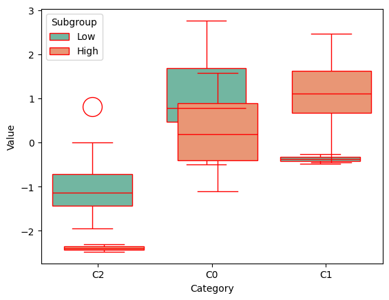
The box plot is a kind of plot for which seaaborn is truly a game changer. It wraps up the most common configuration details into just one function: seaborn.boxplot. Check the seaborn.boxplot page in the oficial documentation.
The following cell generates a typical dataset that is supposed to be explained with boxplots.
X, y = sklearn.datasets.make_classification(
    n_samples=120, n_features=2, n_informative=2, n_redundant=0,
    n_classes=3, n_clusters_per_class=1, random_state=42
)
df = pd.DataFrame({
    "Value": X[:, 0],
    "Category": [f"C{i}" for i in y],
    "Subgroup": pd.cut(X[:, 1], bins=2, labels=["Low", "High"])
})
The following cell draws an ugly plot but, it shows the potential you can achieve with just one command.
sns.boxplot(
    data=df,
    x="Category",
    y="Value",
    hue="Subgroup",
    palette="Set2",
    width=0.2,
    fliersize=20,
    gap=8,
    linecolor="red"
)
plt.show()
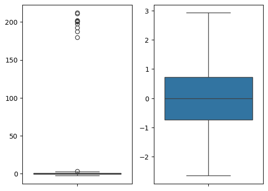
Fliers#
A really typicall issue when dealing with boxplots is poor representation of the general distribution due to a small number of ouliers that change the scale of the entire plot.
To prevent the representation of the fliers, use the showfliers=False argument.
The following cell generates a sample that generally follows some distribution, but there is a small number of fliers that ruin the scale representation the general distribution.
One close to the other are represented plots with removed fliers and not.
Show close to each other are represented plots with and without removed fliers.
sample = np.concatenate([
    np.random.normal(0, 1, size=500),
    np.random.normal(200, 10, size=10)
])
plt.subplot(121)
sns.boxplot(sample)
plt.subplot(122)
sns.boxplot(sample, showfliers=False)
plt.show()
Regression plot#
The sns.regplot function builds a scatter plot that also includes the linear model fitted to the given data.
The next code builds a linear regression-like dataset and applies sns.regplot to it.
sample_size = 200
x = np.random.normal(0, 5, size=sample_size)
y = 0.3*x + np.random.normal(0, 1, size=sample_size)
sns.regplot(x=x, y=y)
plt.show()
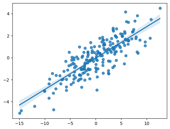
Alongside the regular scatter plot, there is a corresponding linear regression model with confidence intervals.