Pearson correlation coefficient#
Is a popular way to assess the strength of the linear relationship between variables.
from itertools import compress
import numpy as np
import matplotlib.pyplot as plt
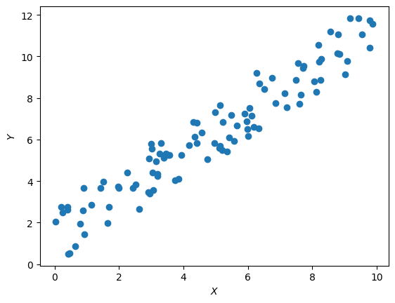
Suppose we have to arrays of values:
\(X=\left\{ x_i \right\}\), \(Y=\left\{y_i\right\}, i =\overline{1,n}\).
The next cell generates and displays \(X\) and \(Y\) that we’ll use in this page.
np.random.seed(10)

sample_size = 100
X = np.random.uniform(0, 10, sample_size)
Y = X + np.random.uniform(0, 3, sample_size)


# we will regularly need some characteristics
# of the sample, so it is rational to calculate
# them at once
X_mean = X.mean()
Y_mean = Y.mean()
X_min, X_max = X.min(), X.max()
Y_min, Y_max = Y.min(), Y.max()

plt.scatter(X, Y)
plt.xlabel("$X$"); plt.ylabel("$Y$")
plt.show()
In the introduced notations, the prisson correlation coefficient can be written as:
Where:
\(cov(X,Y)=\sum_{i=1}^n (x_i - \overline{X})(y_i - \overline{Y})\) - covariation of \(X\) and \(Y\);
\(\sigma_X = \sqrt{\sum_{i=1}^n(x_i - \overline{X})^2}\) - standart deviation of \(X\);
\(\sigma_Y = \sqrt{\sum_{i=1}^n(y_i - \overline{Y})^2}\) - standart deviation of \(Y\).
Covariation#
Is a value in numerator of the Pirosn correlation coefficient. It can be written as:
Consider each component of the summa more carefully: \((x_i-\overline{X})(y_i - \overline{Y})\).
The key feature here is this:
\(sign[x_i-\overline{X}] = sign[y_i-\overline{Y}] \Rightarrow (x_i-\overline{X})(y_i - \overline{Y}) > 0\);
\(sign[x_i-\overline{X}] \neq sign[y_i-\overline{Y}] \Rightarrow (x_i-\overline{X})(y_i - \overline{Y}) < 0\).
In the following plots are shown and idea:
def get_ticks_with_average(ticks, labels, tick, label):
    '''
    Lets you add new ticks and labels
    without overlapping with existing
    labels on the chart
    '''
    available_ticks_mask = (np.abs(ticks - tick) > 0.5)
    ticks = ticks[available_ticks_mask]
    labels = list(compress(labels, available_ticks_mask))
    X_ticks = {
        **dict(zip(ticks, [l.get_text() for l in labels])),
        tick : label
    }
    return dict(
        ticks=list(X_ticks.keys()),
        labels=list(X_ticks.values())
    )

def plot_mean_ticks():

    plt.xticks(
        **get_ticks_with_average(
            *plt.xticks(),
            tick=X_mean,
            label="$\overline{X}$",
        )
    )
    plt.yticks(
        **get_ticks_with_average(
            *plt.yticks(),
            tick=Y_mean,
            label="$\overline{Y}$"
        )
    )
plt.figure(figsize=[10, 3])

plt.subplot(121)
plt.title("Original scatter")
plt.scatter(X,Y)
plt.axvline(X_mean, color="grey", linestyle="--")
plt.axhline(Y_mean, color="grey", linestyle="--")
plot_mean_ticks()

plt.subplot(122)
plt.title("$(x-\overline{X})(y-\overline{Y})$")
x_space = np.linspace(X_min, X_max, 100)
y_space = np.linspace(Y_min, Y_max, 100)
x_mesh, y_mesh = np.meshgrid(x_space, y_space)
z_mesh = (x_mesh - X_mean)*(y_mesh - Y_mean)
plt.pcolormesh(x_mesh, y_mesh, z_mesh, cmap="RdBu_r")
plt.colorbar()
plt.axvline(X_mean, color="grey", linestyle="--")
plt.axhline(Y_mean, color="grey", linestyle="--")
plot_mean_ticks()
plt.xlim(X_min, X_max)
plt.ylim(Y_min, Y_max)


plt.show()
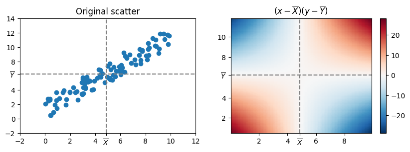
If the point is in the right-top or left-bottom quadrants, the value of the covariation will increase, if it is in the left-top and left-bottom quadrants, the value of the covariation will decrease.